
鸿蒙应用开发-ArkUI入门创建LIST-1
Grid和WaterFlow也可以实现单列、多列布局,如果布局每列等宽,且不需要跨行跨列布局,相比Grid和WaterFlow,则更推荐使用List。List的子组件必须是ListItemGroup或ListItem,ListItem和ListItemGroup必须配合List来使用。在List组件中,ForEach除了可以用来循环渲染ListItem,也可以用来循环渲染ListItemGroup
·
List的子组件必须是ListItemGroup或ListItem,ListItem和ListItemGroup必须配合List来使用。
Grid和WaterFlow也可以实现单列、多列布局,如果布局每列等宽,且不需要跨行跨列布局,相比Grid和WaterFlow,则更推荐使用List。
ArkTS通过ForEach提供了组件的循环渲染能力。
在List组件中,ForEach除了可以用来循环渲染ListItem,也可以用来循环渲染ListItemGroup。
话不多说写代码看注解查效果!!!
//日志模块
import hilog from '@ohos.hilog';
import util from '@ohos.util';
class Contact {
key: string = util.generateRandomUUID(true);
name: string;
icon: Resource;
constructor(name: string, icon: Resource) {
this.name = name;
this.icon = icon;
}
}
class ContactsGroup {
title: string = ''
contacts: Array<object> | null = null
key: string = ""
}
export let contactsGroups: object[] = [
{
title: 'A',
contacts: [
new Contact('艾佳', $r('app.media.icon')),
new Contact('安安', $r('app.media.icon')),
new Contact('Angela1', $r('app.media.icon')),
new Contact('Angela2', $r('app.media.icon')),
new Contact('Angela3', $r('app.media.icon')),
new Contact('Angela4', $r('app.media.icon')),
],
key: util.generateRandomUUID(true)
} as ContactsGroup,
{
title: 'B',
contacts: [
new Contact('白叶1', $r('app.media.icon')),
new Contact('白叶2', $r('app.media.icon')),
new Contact('白叶3', $r('app.media.icon')),
new Contact('白叶4', $r('app.media.icon')),
new Contact('白叶5', $r('app.media.icon')),
new Contact('伯明', $r('app.media.icon')),
],
key: util.generateRandomUUID(true)
} as ContactsGroup,
]
class DividerTmp {
//startMargin和endMargin属性分别用于设置分隔线距离列表侧边起始端的距离和距离列表侧边结束端的距离。
strokeWidth: Length = 1
startMargin: Length = 60
endMargin: Length = 10
color: ResourceColor = '#ffe9f0f0'
constructor(strokeWidth: Length, startMargin: Length, endMargin: Length, color: ResourceColor) {
this.strokeWidth = strokeWidth
this.startMargin = startMargin
this.endMargin = endMargin
this.color = color
}
}
@Entry
@Component
struct Index {
private listScroller: Scroller = new Scroller();
@State egDivider: DividerTmp = new DividerTmp(1, 60, 10, '#ffe9f0f0')
@Builder
itemHead(text: string) {
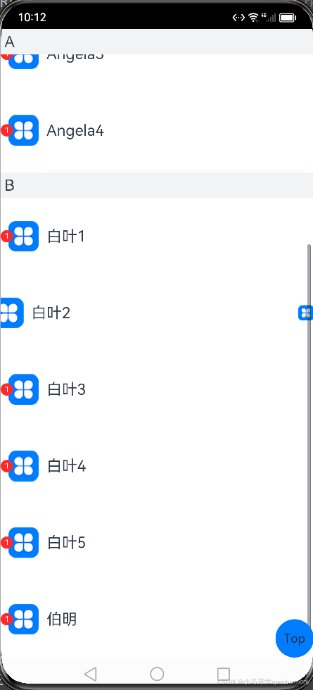
// 列表分组的头部组件,对应联系人分组A、B等位置的组件
Text(text)
.fontSize(20)
.backgroundColor('#fff1f3f5')
.width('100%')
.padding(5)
}
@Builder
itemEnd(index: number) {
// 构建尾端滑出组件
Button({ type: ButtonType.Circle }) {
Image($r('app.media.icon'))
.width(20)
.height(20)
}
.onClick(() => {
hilog.info(0xF0F0,'test',"index"+index)
})
}
build() {
Stack() {
//添加间距5vp
//通过scroller参数绑定一个Scroller对象,进行列表的滚动控制
List({ space: 5, scroller: this.listScroller }) {
ForEach(contactsGroups, (itemGroup: ContactsGroup) => {
ListItemGroup({ header: this.itemHead(itemGroup.title) }) {
if (itemGroup.contacts) {
ForEach(itemGroup.contacts, (item: Contact,index) => {
ListItem() {
//添加标记
Badge({
count: 1,
position: BadgePosition.Left,
style: { badgeSize: 16, badgeColor: '#FA2A2D' }
}) {
Row() {
Image(item.icon)
.width(40)
.height(40)
.margin(10)
Text(item.name).fontSize(20)
}
.width('100%')
.height(100)
.justifyContent(FlexAlign.Start)
}
}.swipeAction({end:this.itemEnd(index)})//设置左滑事件
}, (item: Contact) => JSON.stringify(item))
}
}
}, (itemGroup: ContactsGroup) => JSON.stringify(itemGroup))
}
//确定交叉轴排列的列表项数量
.lanes(1)
//alignListItem用于设置子组件在交叉轴方向的对齐方式
.alignListItem(ListItemAlign.Start)
//设置主轴方向
.listDirection(Axis.Vertical)
//设置分隔线
.divider(this.egDivider)
//控制列表滚动条
.scrollBar(BarState.On)
//设置吸顶,实现粘性标题效果
.sticky(StickyStyle.Header)
.width('100%')
.height('100%')
Button() {
Text("Top")
}.onClick(() => {
//返回列表顶部
this.listScroller.scrollToIndex(0)
}).width(50).height(50).align(Alignment.Center)
}.alignContent(Alignment.BottomEnd)
}
}
更多推荐
 2
2 0
0- 0


 已为社区贡献1条内容

所有评论(0)